@Pandapocalypse
Like, would I be able to go the the in universe tab and somehow set it to have all the categories listed without the big boxes (just listed) and then drop down menus for all the things in the categories.
Like, would I be able to go the the in universe tab and somehow set it to have all the categories listed without the big boxes (just listed) and then drop down menus for all the things in the categories.

Hey @Pandapocalypse! Would you mind clarifying just a little what view you'd like to see (specifically, what things you'd like in dropdowns)? I can probably make something possible if it doesn't already exist. :)
However, there are a few existing listings that might be helpful:
The latter looks like this (and might be close to what you're looking for):

I might be misunderstanding what you're looking for, so if I am please do let me know! However, those are the two different ways to view all your pages per universe right now. I'd be happy to add another though. :)

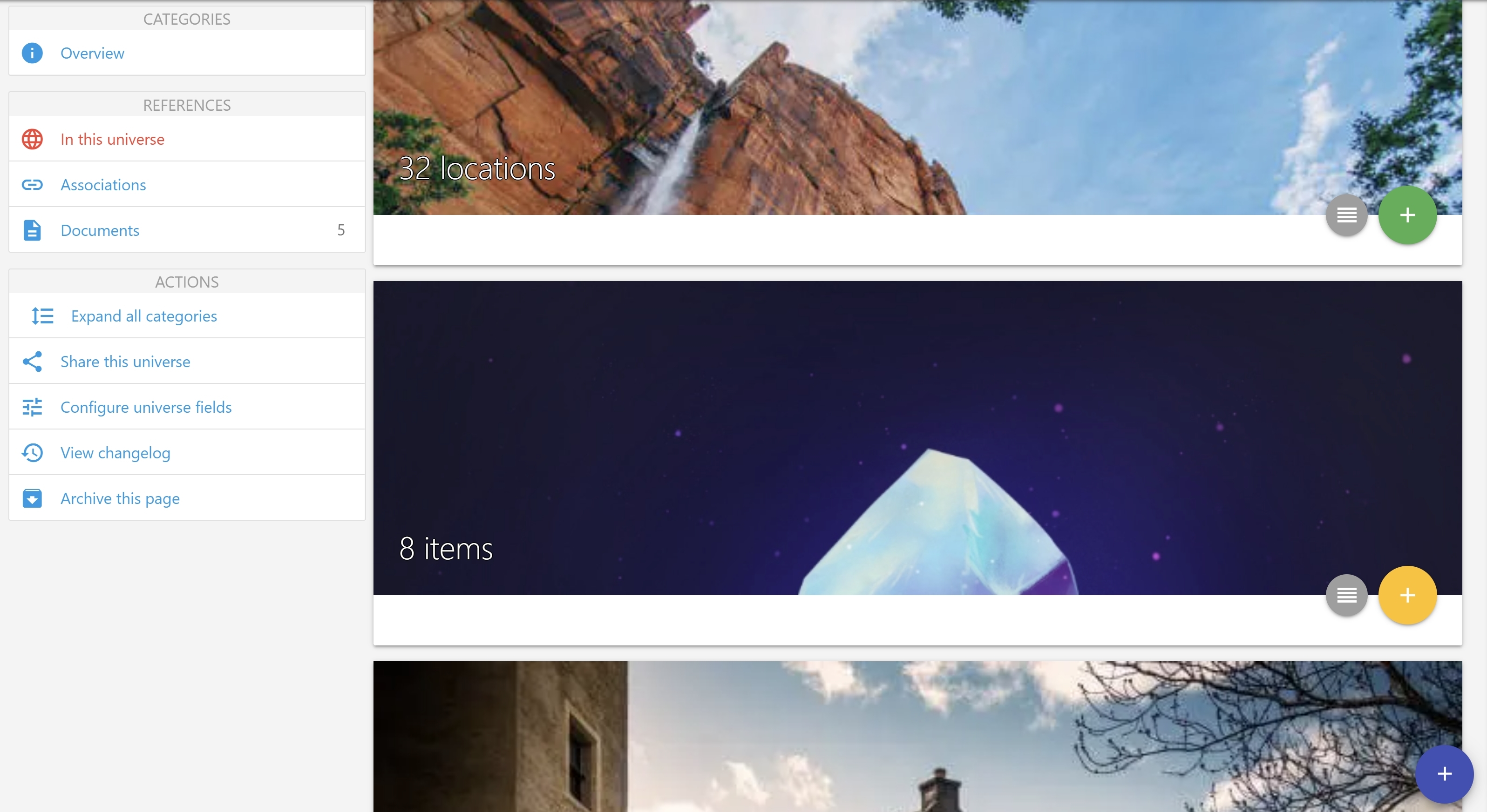
If I view the "in this universe" tab, for me it looks like the below image, with big blocks for each category. I have to click on those to view each list individually, on separate pages. How would I get it to look like your screenshot, with all lists on one page?
Edit: For anyone else wondering, you can sort of accomplish this by searching for a blank string: https://www.notebook.ai/search?utf8=%E2%9C%93&q= The display isn't great, but it does the trick for what I was trying to do.


Oh, if you click on the image of any of the blocks in our screenshots, they change from an image to the list. It's not the best solution (and I can see how it's not clear it's even there!) so I'll get a better universe hub that shows everything in it on the to-do list!

Aha, sure enough! Yeah, it's a bit confusing right now since the image doesn't look clickable, and the only things that do (the buttons to the side) only let you view the lists on separate pages.
The following keyboard controls are supported across Notebook.ai. All keyboard controls are disabled when editing a document or notebook page.